DaBang has been a key player in Korea's real estate app market since 2012, but with growing competition from newer and more advanced services, it needed to evolve to stay ahead.
This project aimed to tackle usability challenges, enhance the experience for both tenants and realtors, and identify standout features that set DaBang apart. The focus was on improving information accuracy, streamlining the listing process, and integrating innovative technologies to deliver a faster, safer, and more efficient home-finding experience.
Background
DaBang, launched in 2012, was Korea’s first domestically developed real estate app, providing a seamless platform to connect tenants and realtors. Over the years, it built a strong reputation, but as new competitors entered the market with cutting-edge technologies like AI and 3D tools, DaBang faced increasing pressure to innovate.
I joined DaBang as a UX/UI Designer during a critical transition period, where the company was navigating internal challenges while striving to stay competitive. My role was to bridge the gap between management and development teams, enhance usability, and deliver a superior experience for both tenants and realtors.
Key Contributions
Redefined the design process – Improved cross-team collaboration, ensuring clarity in workflows and better visibility into project milestones for stakeholders.
Enhanced tenant experience – Tackled concerns about inaccurate property listings and scams by proposing solutions to increase trust and security.
Optimized realtor workflows – Streamlined the property listing process, saving time and improving efficiency for realtors managing online sales.
Leveraged market insights – Conducted competitor and customer trend research to identify key opportunities for DaBang to regain its competitive edge.
Proposed innovative solutions – Explored AI and 3D technology integration to modernize the platform and meet evolving user expectations.
Understanding the Problem
As a well-established player in Korea’s real estate app market, DaBang faced growing challenges in staying competitive amid evolving user expectations and increasing competition. To enhance the platform and deliver a more seamless experience, I conducted in-depth research on the domestic real estate market and the unique characteristics of Korean real estate services.
This research focused on understanding user expectations, identifying key pain points, and evaluating the platform’s existing functionality to uncover opportunities for improvement.
Research Objectives
Understand user needs – Gain insights into the goals, needs, and frustrations of both tenants and realtors.
Identify experience gaps – Analyze the existing user journey to improve trust, efficiency, and usability.
Develop actionable insights – Provide strategic recommendations to enhance the platform and differentiate DaBang from competitors.
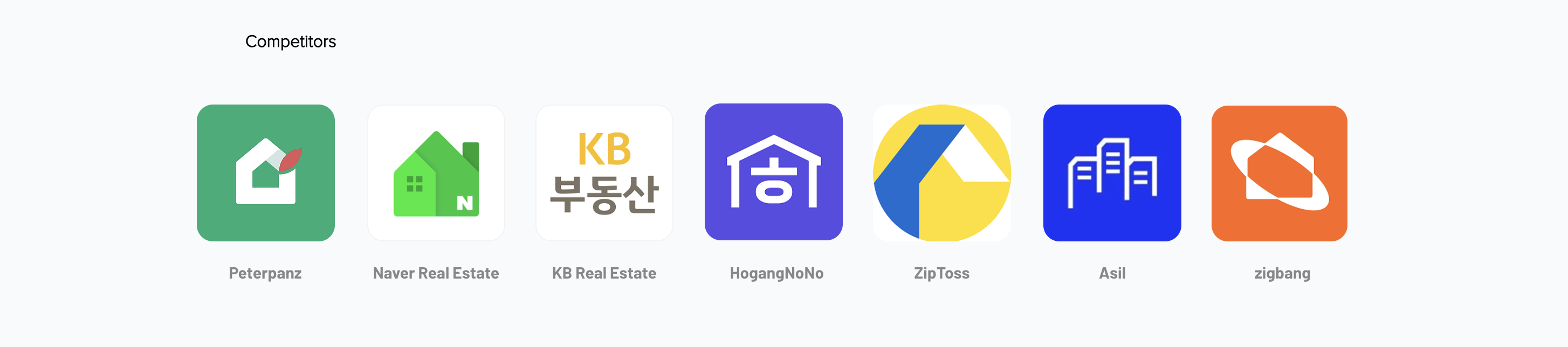
Competitors
Competitor Journey
User Voice
Gathering Insights
After collecting user feedback and analyzing competitor research, I used affinity mapping to synthesize key pain points and insights.
By categorizing these findings into common themes, I identified essential service features that impact user satisfaction and engagement.
Seamless Navigation – A familiar interface with intuitive menus and a hassle-free sign-up process enhances the overall experience.
Reliable & Detailed Insights – Government-verified property information and visualized neighborhood amenities (e.g., schools, transportation) build trust and improve decision-making.
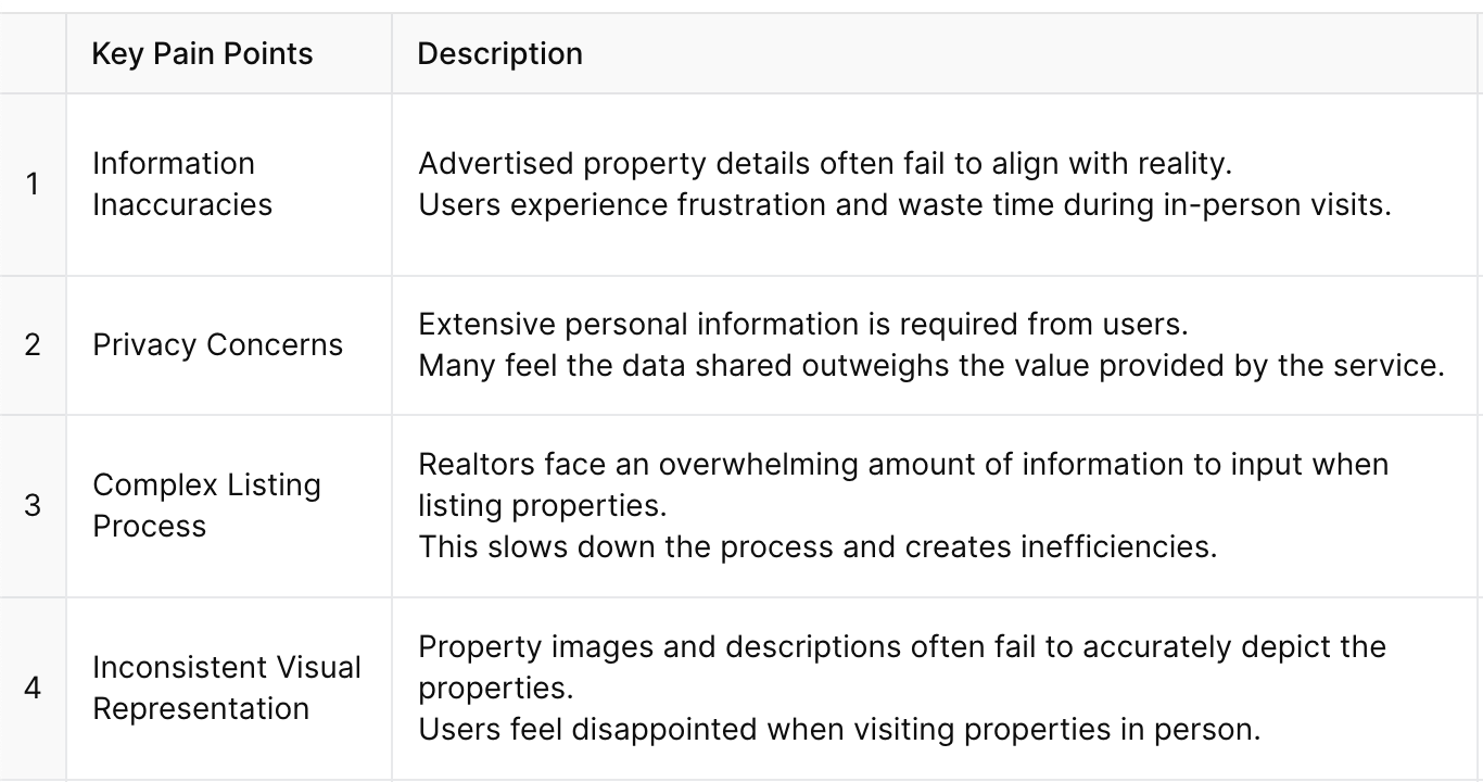
Key Pain Points
By deeply analyzing the user journey and DaBang’s market position, I identified critical areas for improving trust, accuracy, and efficiency. These insights became the foundation for redesigning the platform, creating a seamless, fast, and secure home-finding experience for both tenants and realtors.
Prioritizing Key Issues
Based on the identified pain points and research insights, the following priorities were established to streamline the sales registration process and enhance the overall user experience:
1. Optimize Screen Flow and Structure
Reevaluate the step order in the sales registration process to ensure a logical and intuitive flow.
Reduce excessive scrolling by breaking down the process into manageable steps.
Consider a multi-screen approach, as seen in competitor Company B, to minimize user fatigue and improve clarity.
2. Simplify Information Input
Minimize required fields by prioritizing essential information.
Implement intelligent input mechanisms, such as pre-filled suggestions and drop-down menus, to reduce user effort.
3. Enhance Readability and Visual Design
Redesign the interface to improve content readability and visual hierarchy.
Use progressive disclosure to present information in digestible chunks, preventing information overload.
4. Reduce User Fatigue
Ensure each step in the registration process feels quick and achievable.
Include visual progress indicators to provide users with a sense of accomplishment as they complete each stage.
5. Learn from Competitors
Apply insights from competitor research to adopt best practices in screen flow, content organization, and interface design.
Incorporate features that improve usability without adding cognitive load, inspired by well-structured multi-screen processes from competitors.
6. User-Centered Testing
Conduct usability tests on the redesigned process to validate improvements and ensure a smooth, efficient, and user-friendly experience.
Gather ongoing user feedback to identify further refinements.
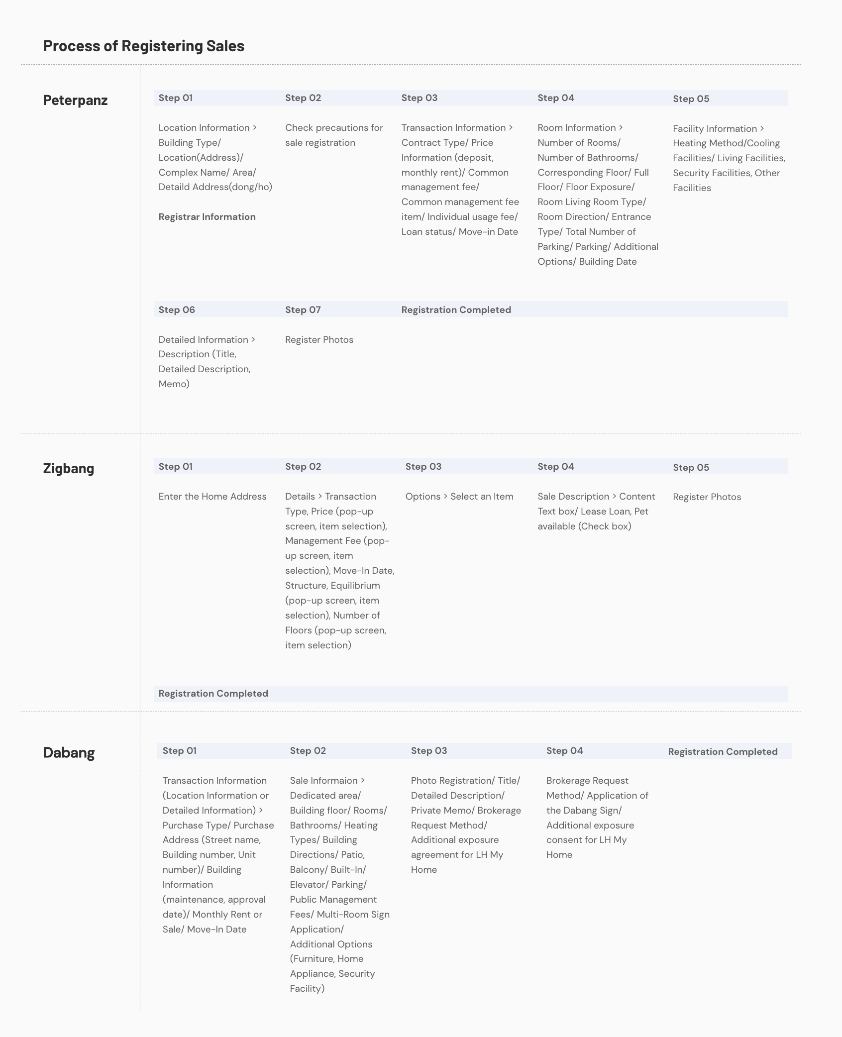
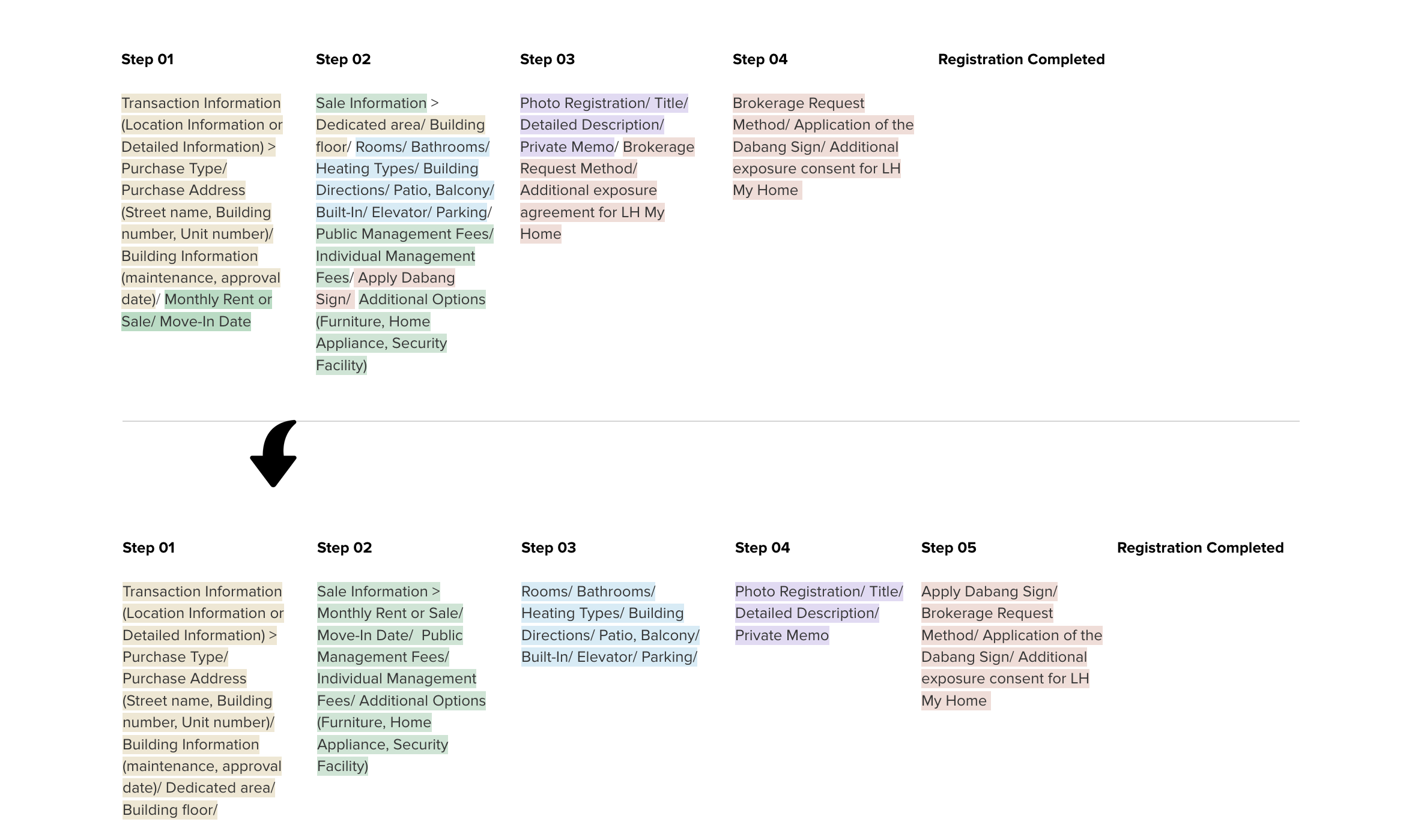
I meticulously analyzed and documented the sales registration processes of both DaBang and its competitors, breaking down each step in detail.
While the overall process flow was similar across companies, notable differences emerged in content composition, screen structure, and interface design.
The comparison revealed that DaBang’s registration process lacked clarity and coordination in procedural priorities.
To address this, I restructured the workflow by defining clearer categories, reducing user confusion, improving information retention, and ensuring a smoother, more intuitive experience when entering required details.
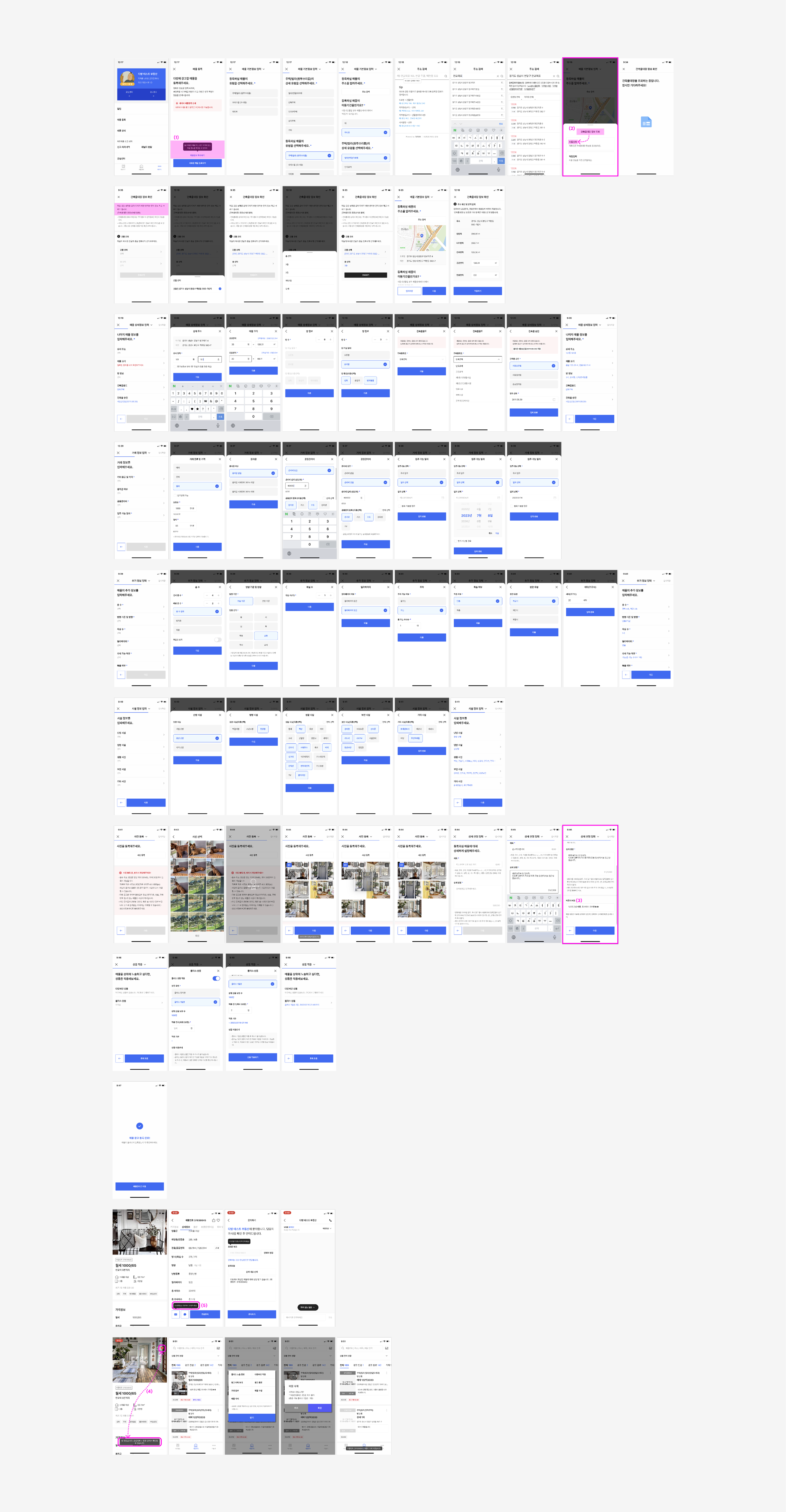
Redesigning & Streamlining the Registration Process
After identifying usability issues in DaBang’s sales registration process, I conducted a detailed analysis to pinpoint key pain points and enhance the overall user experience.
Refining the Structure
To improve clarity and usability, the registration flow was redesigned with a focus on making the process more intuitive and user-friendly. Key adjustments were prioritized to eliminate friction and create a smoother experience.
Sales Registration Process
Redesigning the Registration Process
Designing for Realtors
The interface needed to strike a balance between professionalism and simplicity, ensuring it feels approachable yet competent.
Language and steps were refined to be universally understandable, catering to users across different age groups and experience levels.
Creating a Supportive Experience
To help users feel confident and supported throughout the registration process:
Guided assistance was introduced at every step to prevent frustration, especially when encountering difficulties.
Encouraging language replaced directive phrasing—using “You can” instead of “You should” to foster a friendly, advisory tone.
Usability Enhancements
Checkboxes: The current checkboxes were too small and difficult to click. Increasing their size or introducing alternative button designs improved usability.
Segmented Screens: Inspired by platforms like Zigbang, Peterpanz, and Airbnb, the registration flow was split into smaller steps rather than one long scroll. This made progress feel more manageable and engaging.
Welcoming Onboarding: The process now begins with a friendly, personalized greeting, such as: “Hi [Name]! What kind of sale are you looking to register?” This simple touch sets a positive tone and enhances user engagement.
Tailoring Interactions
Different button types were strategically used based on interaction needs:
Radio Buttons: Ideal for single-choice questions.
Box-Style Buttons: Effective for multiple options, especially when dealing with a large number of choices.
By implementing these changes, the registration process became more engaging, intuitive, and user-friendly, ensuring a seamless experience for all users.
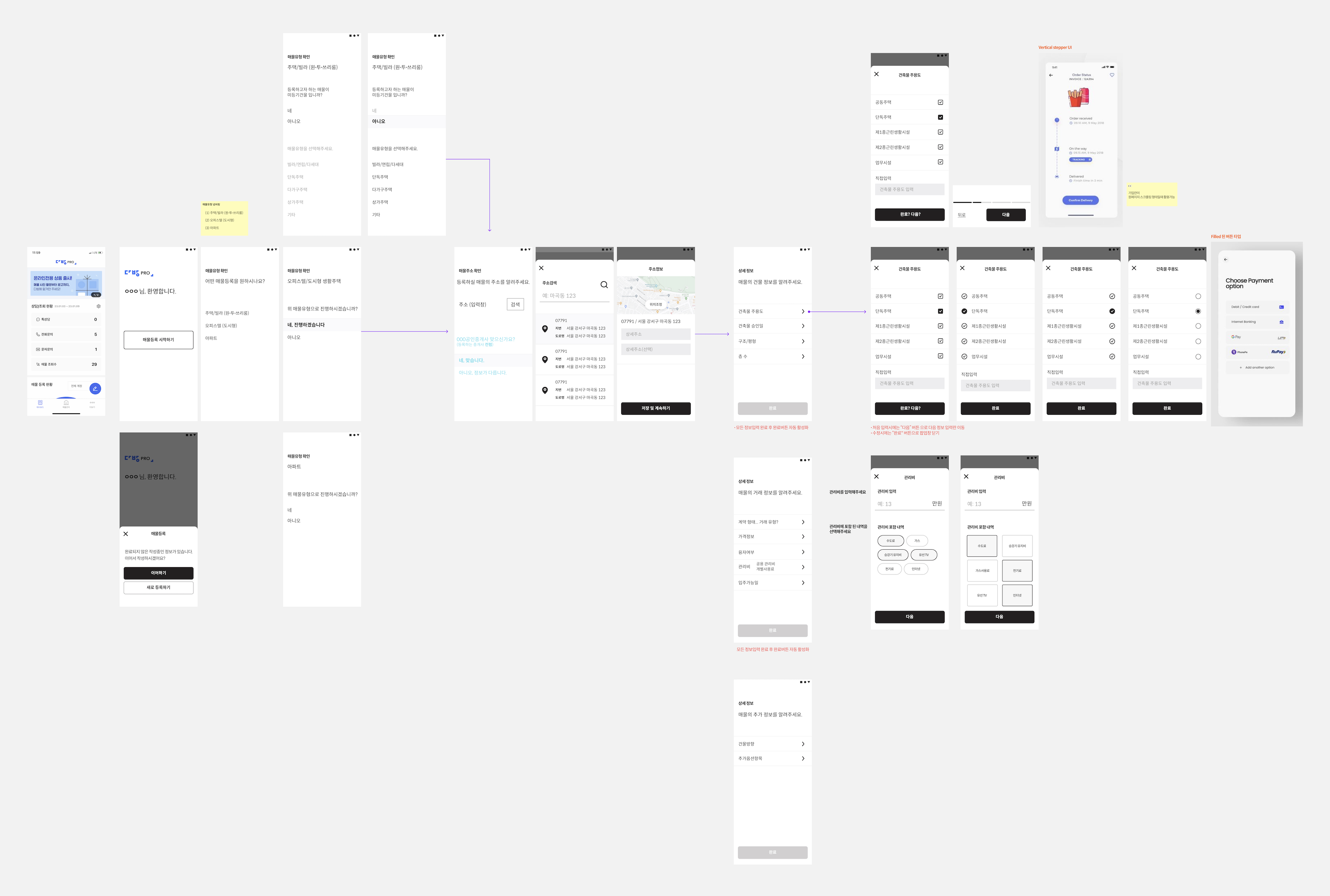
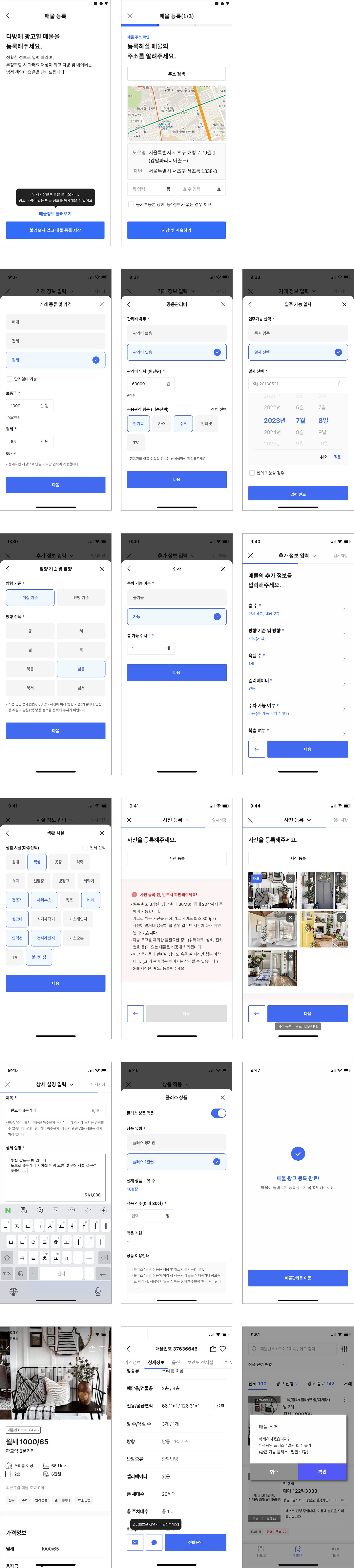
Wireframing the Solution
I created high-fidelity mockups in Figma and imported them into InVision, enabling engineers to inspect the designs and extract the necessary HTML and CSS code.
Collaborating closely with the Front-End team, I spec’d out any missing interactions that were not fully covered in the high-fidelity mockups. Before each feature went live, I conducted a UX review of front-end implementations to ensure alignment with the intended design.
Design Resolution
The new wireframes introduced several key features to enhance usability, streamline workflows, and improve security:
1. ‘Load Draft Content’ Feature
A new button allows users to seamlessly integrate property details using the ‘Building Registry’ API from the Korean Ministry of Land, Infrastructure, and Transport.
When users input an address, the system automatically retrieves accurate property details, eliminating the need for manual data entry and significantly improving efficiency.
2. Private Memo Section for Administrators
A dedicated memo section was added, accessible only to administrators, for securely inputting and managing detailed property information.
3. Favorites Icon
Users can now save and revisit preferred properties with a newly added favorites icon, enhancing convenience and accessibility.
4. Secure Communication for Users
To mitigate phishing risks, a secure communication feature allows users to contact agents without revealing their actual phone numbers.
The system generates temporary phone numbers for safe, private interactions, ensuring both security and peace of mind.
These enhancements were designed to elevate the user experience, strengthen security, and create seamless interactions for all stakeholders.
Final Design
Final Work Flow
Final Design Sample Image
Results & Takeaways
Integrating our system with Naver Real Estate led to a smoother user experience and a significant increase in engagement, driving more traffic to the DaBang app. User feedback confirmed the effectiveness of the updated features, while real-world testing demonstrated their usability and efficiency.
Key Takeaways
Strategic Planning for MVP Launches Defining and delivering a clear Minimum Viable Product (MVP) strategy is essential for managing scope, ensuring timely delivery, and maintaining product quality.
Continuous Iteration Through User Testing The design process doesn’t end after launch. Actively gathering and incorporating user feedback ensures the product evolves to meet user needs effectively.
Cross-Functional Collaboration Engaging developers early helps identify technical constraints upfront, reducing rework and ensuring design strategies align with feasibility.

.jpg)