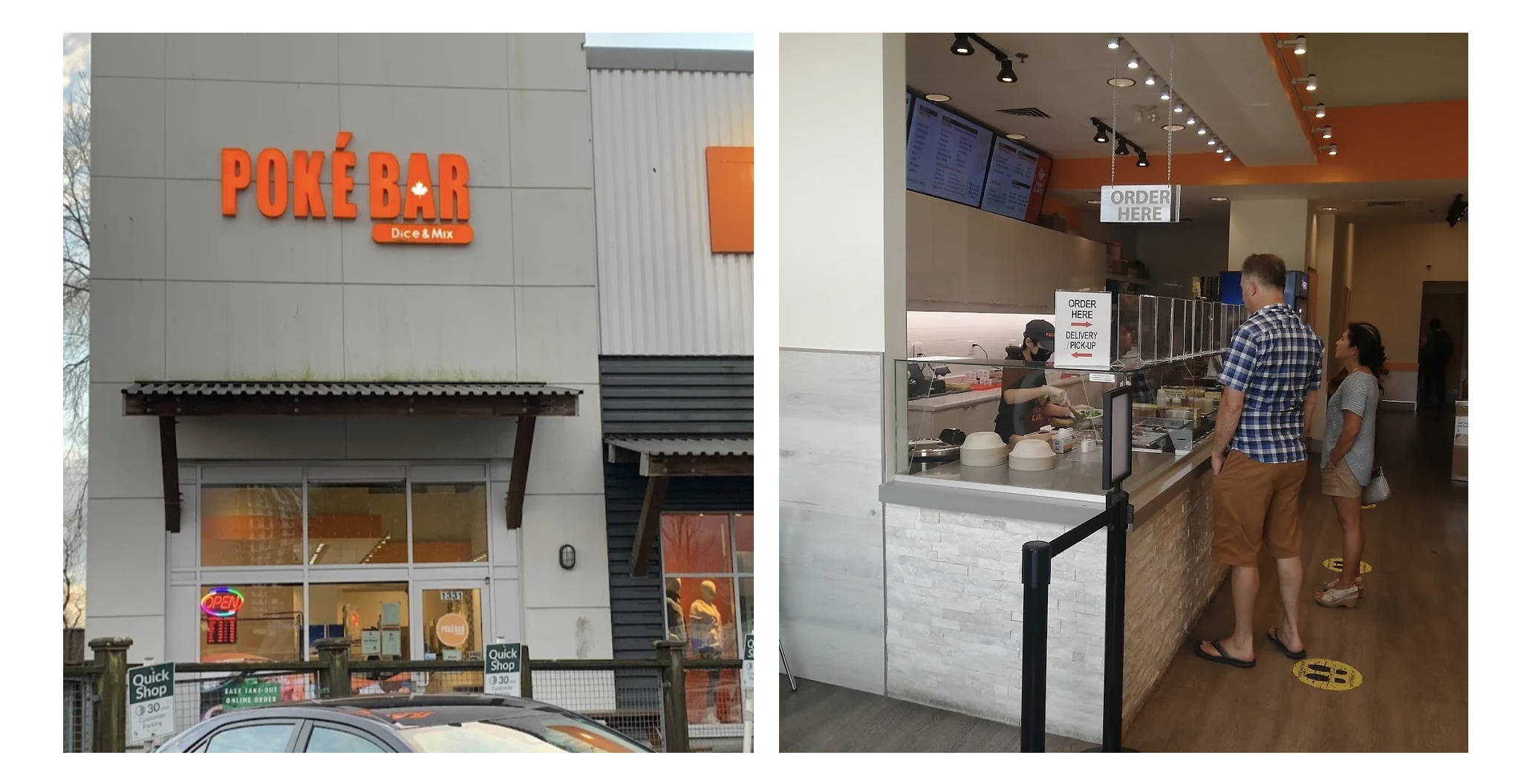
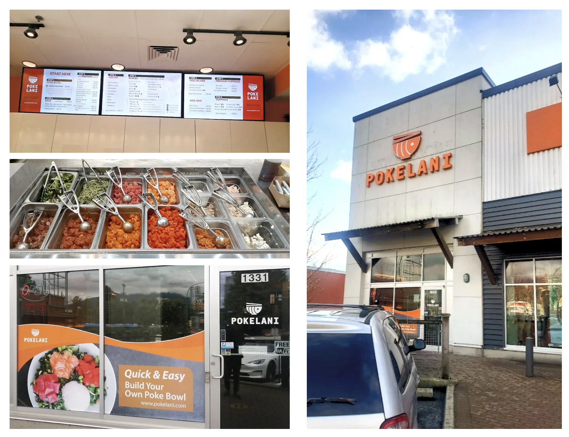
PokeLani, a beloved poke restaurant in North Vancouver, BC, embarked on a brand transformation after serving its community for over five years under the name Poke Bar. With a vision to revitalize its brand and embrace the digital era, the restaurant sought to create a seamless online ordering experience that reflects its vibrant personality and commitment to quality.
This project focused on rebranding PokeLani, designing a visually engaging and user-friendly website, and enhancing the overall customer experience—both for dine-in guests and online orders. The goal was to establish a strong digital presence, showcase signature dishes with engaging visuals, and provide an intuitive platform for customer interaction.
By addressing usability challenges and implementing a cost-effective, scalable maintenance plan, the new website positioned PokeLani for long-term success in a competitive market.
For over five years, PokeLani (formerly known as Poke Bar) had built a loyal customer base in North Vancouver. However, as their previous branding and operational contract ended, they faced a critical turning point—an opportunity to redefine their identity and future direction.
With rising competition in the restaurant industry and growing consumer reliance on digital platforms, PokeLani recognized the need to modernize. Their rebranding effort was not just about aesthetics—it was about aligning their identity with their vibrant menu, improving digital interactions, and providing a seamless online experience.
This transformation was designed to enhance customer engagement, streamline operations, and attract both loyal and new customers, ensuring that PokeLani remains a standout brand in an increasingly digital-first market.
While PokeLani’s previous website was functional, it posed significant usability challenges—especially for first-time users. The lack of a clear and intuitive user journey made navigation confusing, particularly during the ordering process. Multiple buttons led to the same stage, and there was no dedicated section explaining the customizable nature of poke bowls. As a result, new customers lacked guidance, making the experience overwhelming—similar to navigating complex menus in restaurants like SUBWAY, where too many options without clear instructions can lead to decision fatigue and hesitation.
For returning customers, the process was familiar and manageable. However, new visitors faced friction, increasing the risk of losing potential customers to more familiar dining options. This disconnect between new and returning users was not only a barrier to user satisfaction but also a missed opportunity for business growth.
To address these pain points, the redesign focused on:
✅ A clear and engaging onboarding experience for first-time users
✅ Streamlined navigation and guidance to facilitate ingredient selection and order customization
✅ A seamless, friction-free payment process to enhance customer satisfaction
By understanding the needs of both new and returning customers, the rebranding and redesign efforts aimed to create a user-friendly, inclusive, and visually engaging platform—one that leaves a lasting positive impression and strengthens customer loyalty.

This project aimed to create a seamless and enjoyable experience for both PokeLani’s customers and the business. By moving beyond the limitations of their previous contract, we explored PokeLani’s unique vision, identity, and goals—elements they hadn’t fully expressed before.
1. Accessible Information – Ensuring customers can easily find details about PokeLani’s menu, services, and brand story.
2. Website Renewal – Redesigning the website with a cost-effective web builder for easy maintenance.
3. Confidentiality – Maintaining brand consistency by keeping the web builder undisclosed on the site.
4. Expanded Offerings – Introducing gift cards and franchise menu pages to enhance engagement.
5. Inspiration Sources – Drawing insights from Subway’s website for layout and user experience.
6. Reference Model – Using Pokebar Canada’s website as a template for design improvements.
7. Menu Structure – Organizing content with clear and functional menu pages for better navigation.
✅ Easy Information Access – Making food-related details and the ordering process intuitive and effortless.
✅ Streamlined Ordering & Payment – Ensuring a smooth, friction-free online ordering experience.
✅ Clear Location Information – Providing accurate directions to help customers find the restaurant easily.
📌 Integration with Food Ordering Services – Expanding reach through external delivery platforms.
📌 Enhanced Brand Image – Strengthening PokeLani’s identity for better customer trust and engagement.
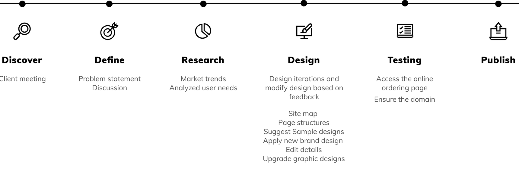
Before starting the design process, I prioritized gaining a deep understanding of PokeLani’s expectations and challenges to ensure the renewal project effectively addressed their key concerns. This phase involved gathering insights from the client and stakeholders, identifying priorities, and exploring potential solutions.

🔹 High Priority – Ensure accessible and intuitive navigation, especially for first-time users unfamiliar with poke customization.
🔹 Medium Priority – Expand website functionality by integrating gift card options and detailed menu pages to enhance user engagement.
🔹 Low Priority – Consider alternative hosting providers if long-term issues with Bluehost persist.
The gathered insights provided a clear roadmap for the website renewal project. By directly addressing PokeLani’s core concerns, the design solution delivered a seamless, responsive, and user-friendly experience—one that effectively met both customer expectations and business goals.
Our vision was to establish PokeLani as a leading local restaurant with a seamless online ordering experience and a strong digital presence. The project focused on three core objectives:
Beyond design and development, the vision extended to creating a cohesive and professional brand image that resonates with PokeLani’s target audience, attracts new customers, and strengthens loyalty among existing patrons.
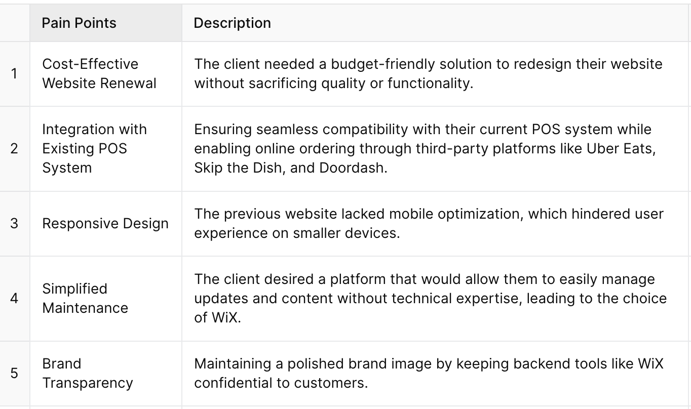
The previous website was built using Webflow, but for the updated version, WiX was chosen due to its integrated hosting, budget-friendly structure, and ease of management—perfectly aligning with PokeLani’s operational needs.
Among the many available web builders, such as Webflow and WordPress, WiX stood out for its intuitive interface, allowing seamless content updates and site management without requiring technical expertise. This made it an ideal choice for a small business with limited resources.
WiX also offers a comprehensive, all-in-one package that includes hosting and domain services, eliminating the need for separate management. This reduces complexity, saves time, and streamlines operations for busy restaurant owners.
Additionally, the new website maintains PokeLani’s existing POS system while integrating directly with Uber Eats, Skip the Dish, and Doordash, ensuring a seamless ordering experience and expanding PokeLani’s digital reach.
To align the design with PokeLani’s vision, I engaged in in-depth discussions with the client to fully understand their preferences and brand identity. Through these conversations, I identified key themes that served as the foundation for a cohesive visual direction.
1. Enhance Image Quality – Upgrade visuals for improved resolution and clarity.
2. Improve Readability – Restructure page layouts for better content flow and accessibility.
3. Optimize Call-to-Action Visibility – Adjust contrast and placement of the CTA button to increase emphasis and user engagement.
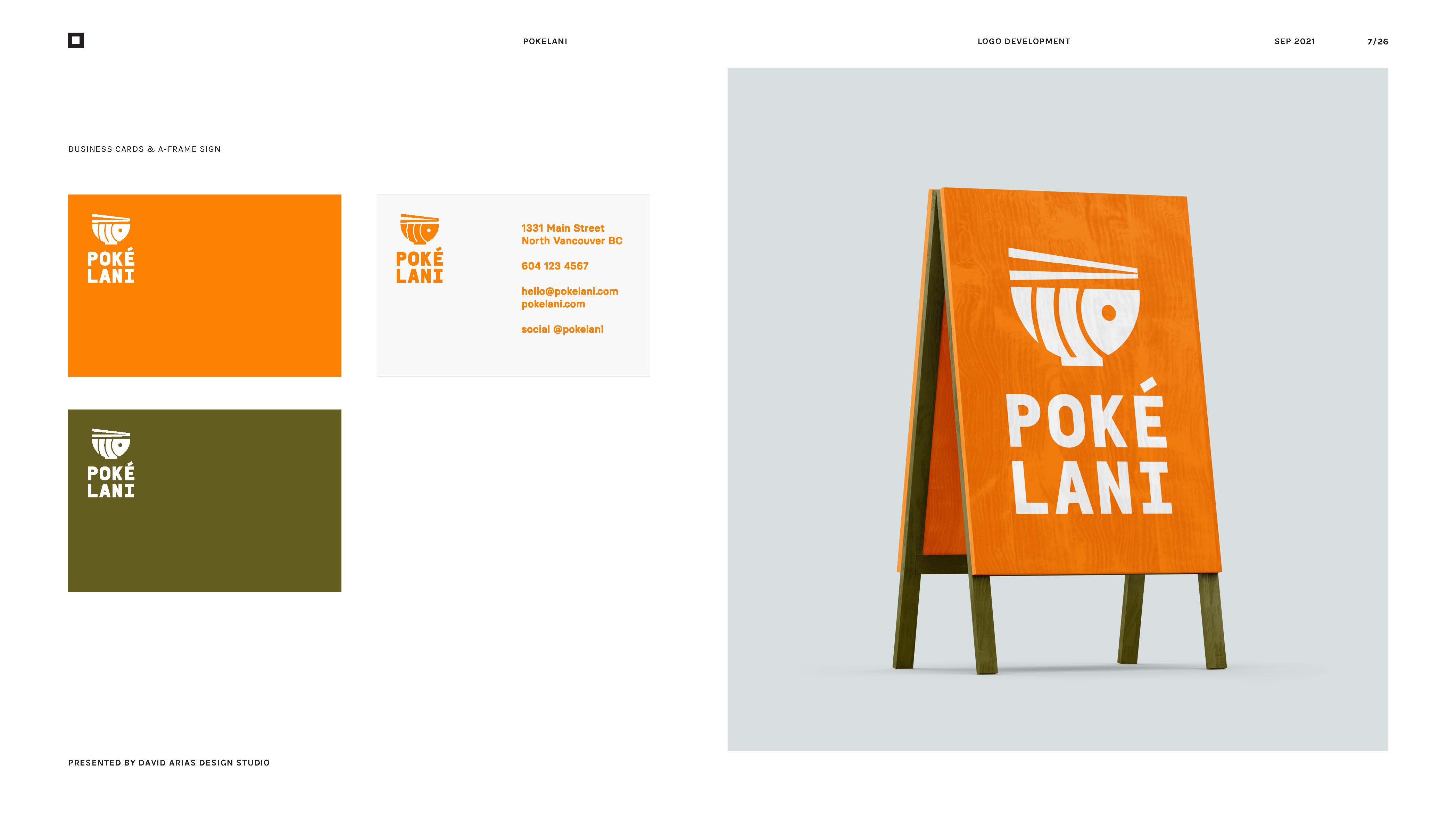
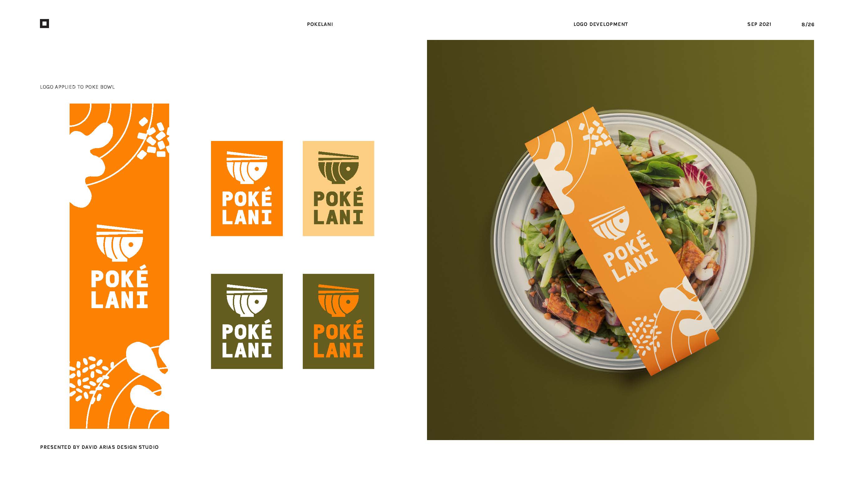
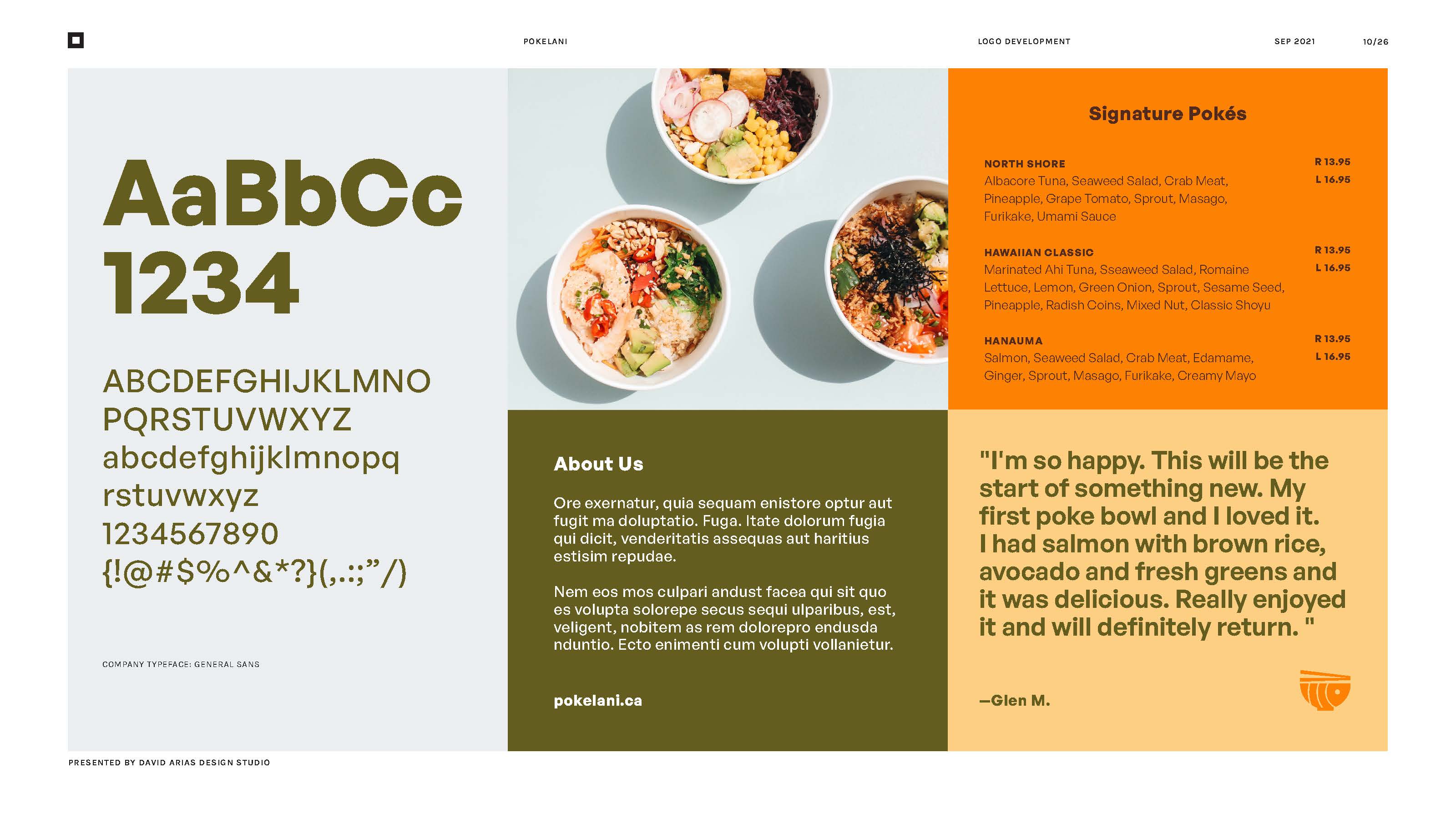
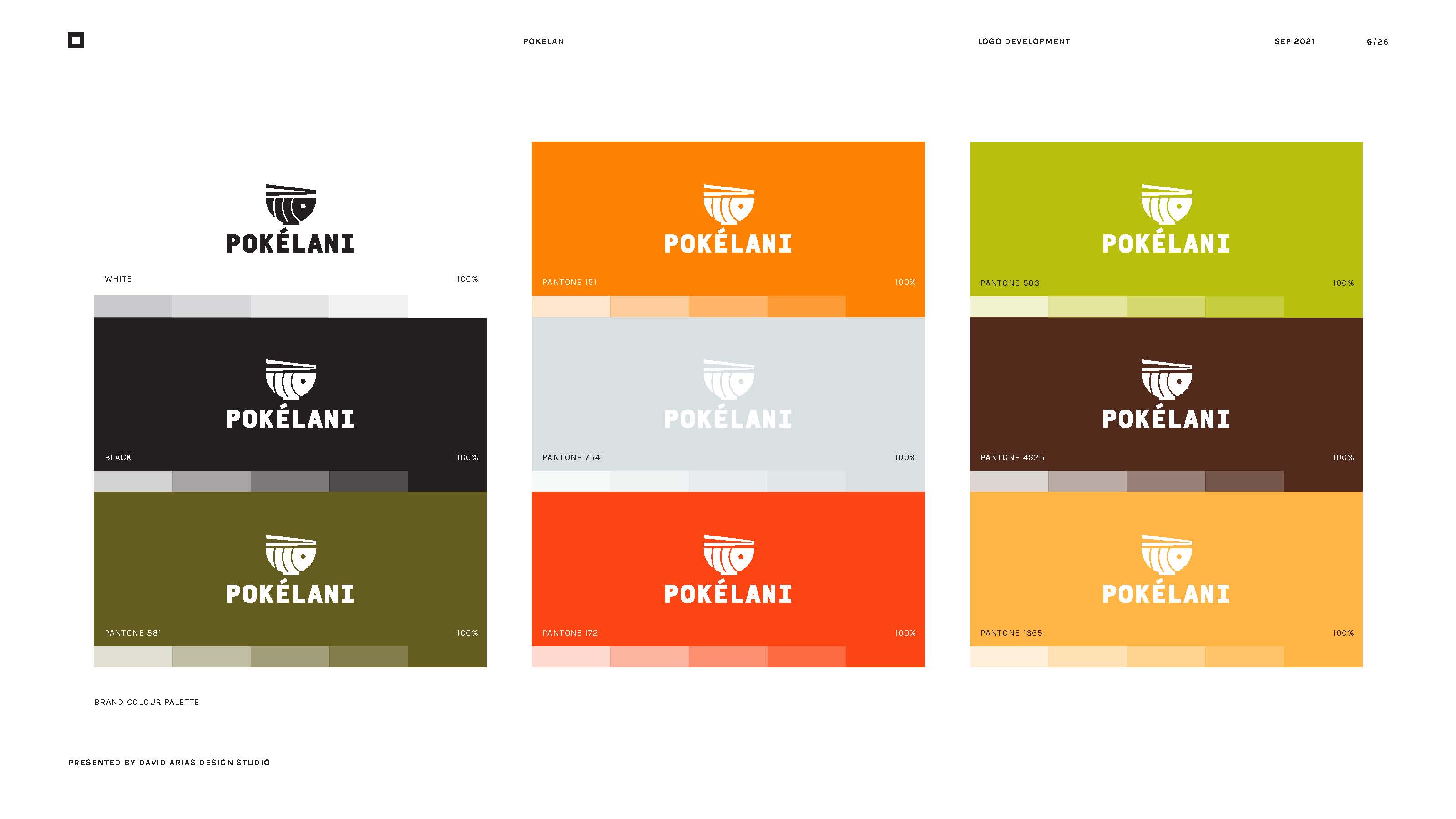
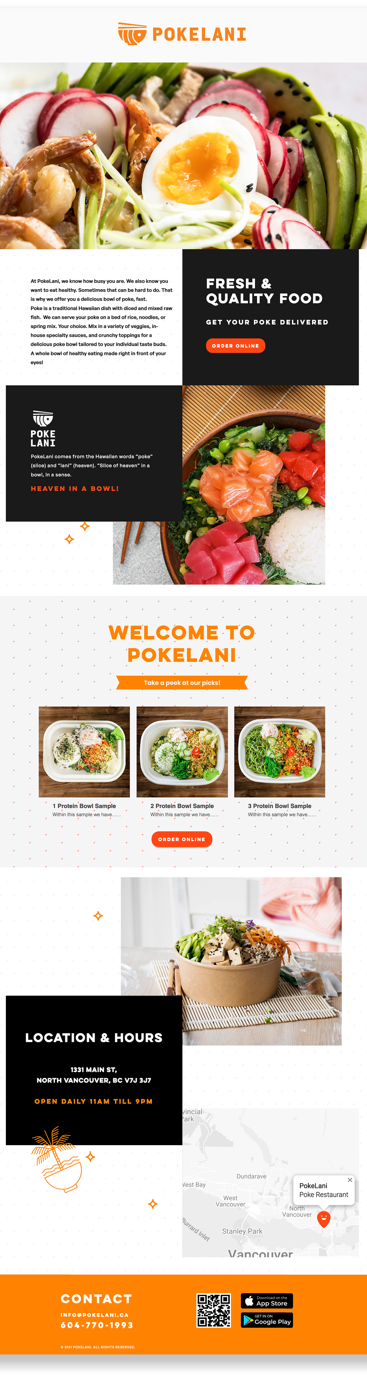
The new PokeLani logo encapsulates the essence of a poke bowl, drawing inspiration from its core ingredients like salmon and sashimi. The design seamlessly blends these elements into a bowl-shaped visual, creating a strong and recognizable identity.
The circular lines subtly represent the freshness and composition of a poke bowl, while the chopsticks add depth, symbolizing immediacy and enjoyment. The integration of the word "Poke" reinforces the connection between the bowl, fish, and chopsticks, ensuring a cohesive brand identity.
To enhance visual appeal, a vibrant orange hue was chosen, reflecting the natural tones of fresh ingredients while drawing attention. The carefully selected bold yet refined typography conveys confidence and professionalism, complementing the overall balance of the design.
By combining elegance with approachability, the logo captures the authentic experience of poke dining, making it instantly recognizable and inviting.
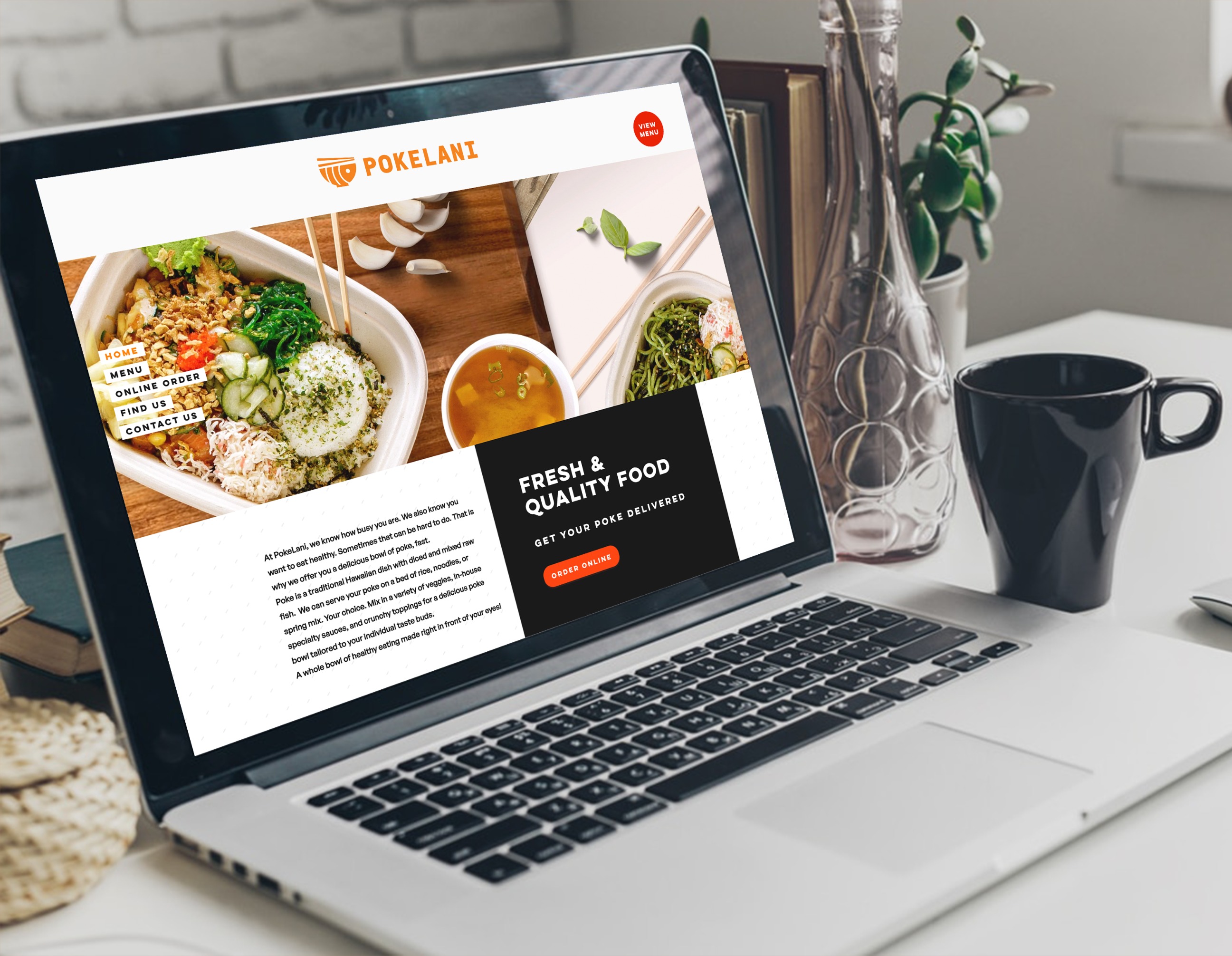
To capture users’ attention and stimulate their appetite, I designed a visually engaging landing page featuring high-quality images that highlight PokeLani’s fresh ingredients and signature dishes.
Strategic call-to-action (CTA) buttons were placed to seamlessly guide users through the online ordering process, ensuring a smooth and intuitive experience. Additionally, I carefully integrated the rebranded colors and imagery to reinforce PokeLani’s brand identity.
I created two draft versions and presented them to the client. After reviewing both, the client selected the first draft as the foundation for the final design.
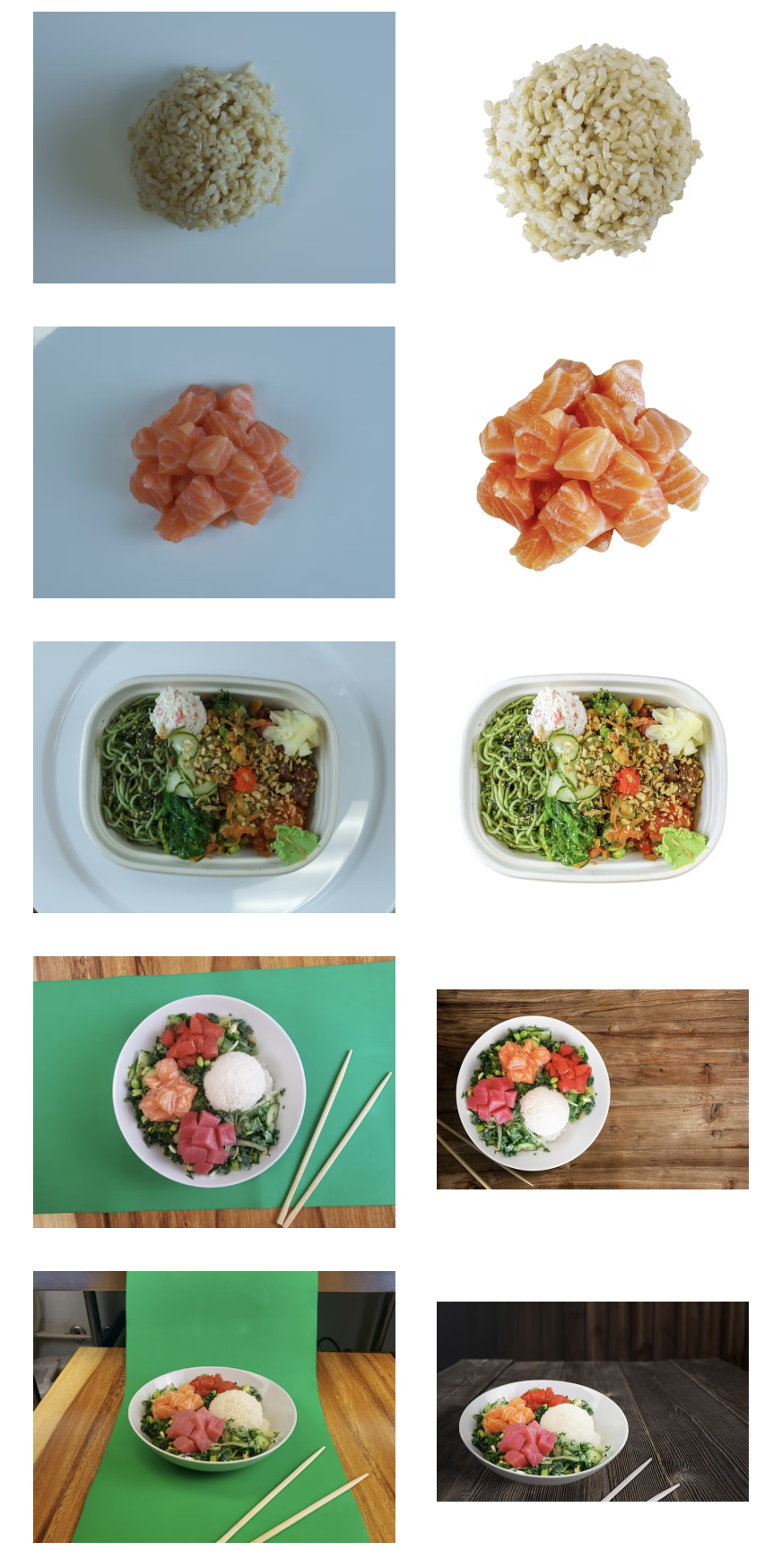
Visual imagery is essential in shaping the user experience, especially for food-related content. To enhance the overall appeal of PokeLani’s website, I focused on improving image quality beyond what was available on the previous site.
I carefully reviewed and edited the client-provided photos to ensure they were clear, vibrant, and appetizing. These enhancements were designed to stimulate users' appetites, create a lasting visual impact, and reinforce PokeLani’s fresh and high-quality brand identity.
To highlight PokeLani’s signature menu on the landing page, I designed a dedicated frame that enhances visibility and draws user attention. Keeping the branding colors in mind, I created two design drafts and presented them to the client.
After reviewing both options, the client selected the second draft as the final design, which became the foundation for the completed project.
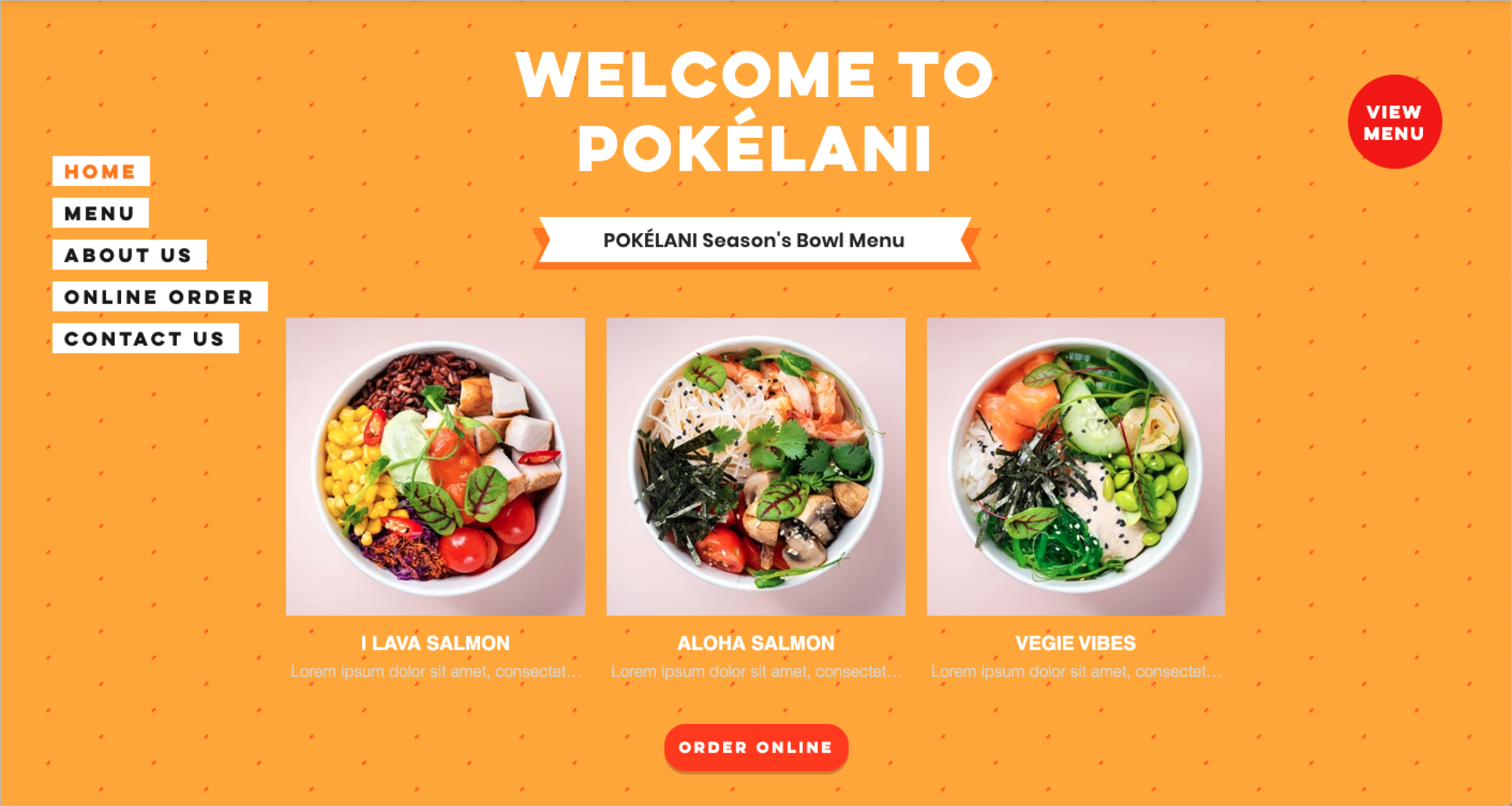
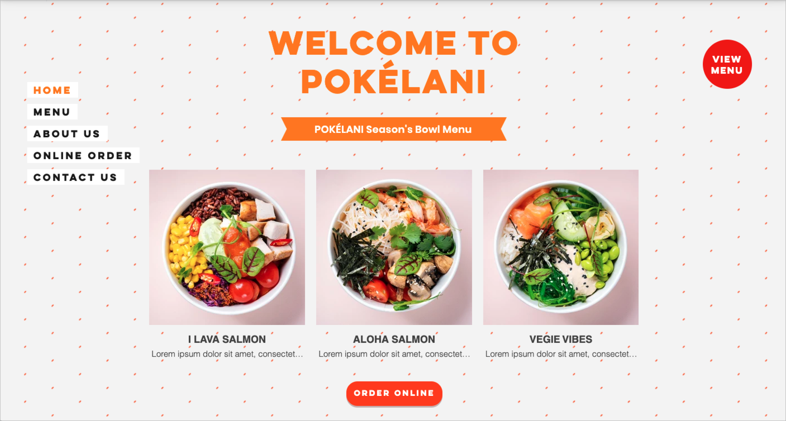
The landing page seamlessly integrates PokeLani’s rebranded colors, featuring a harmonious blend of orange and white, with black accents added for emphasis.
Call-to-action (CTA) buttons were strategically placed to align with the brand introduction and highlight PokeLani’s signature menu. To ensure clear navigation, the menu button was designed with a distinct style, making it easily recognizable and visually differentiated from the others.

An analysis of website usage data revealed a significant increase in user traffic since the site update in April.
📱 Mobile users dominated, accounting for 76% of total traffic, while desktop users made up only 23%, underscoring the importance of a mobile-first experience.
📊 Traffic patterns showed notable peaks on Mondays and Wednesdays, while Saturdays had the lowest engagement levels.
🔍 Most website visits originated from Google searches, highlighting strong search engine visibility and user reliance on organic discovery.

The project successfully met its objectives, delivering a user-friendly and visually engaging website that aligned with PokeLani’s rebranding goals. The redesigned site enhanced the online ordering experience by incorporating seamless navigation, clear call-to-action buttons, and appetizing visuals. Additionally, the final design garnered positive user feedback and was completed within budget constraints, ensuring both client satisfaction and business viability.
🔹 Effective Client & Process Management
Balancing client expectations, project deadlines, and resource limitations was essential for success. This experience strengthened my ability to manage complex projects efficiently while maintaining client satisfaction.
🔹 Iterative Design & Feedback Integration
Refining multiple design iterations based on client feedback ensured that the final product aligned with their vision and brand identity. This iterative approach reinforced the value of continuous improvement in design.
🔹 User-Centered Focus & Market Implementation
By integrating user feedback throughout the design process, I developed a solution that truly resonated with the target audience. The successful market launch validated the impact of a user-centered approach in digital product design.
This project not only strengthened my ability to deliver polished, functional designs but also deepened my understanding of balancing creativity, usability, and business objectives to create impactful digital experiences.


I am currently available for new projects and collaborations, bringing a wealth of experience in crafting innovative, user-centered designs