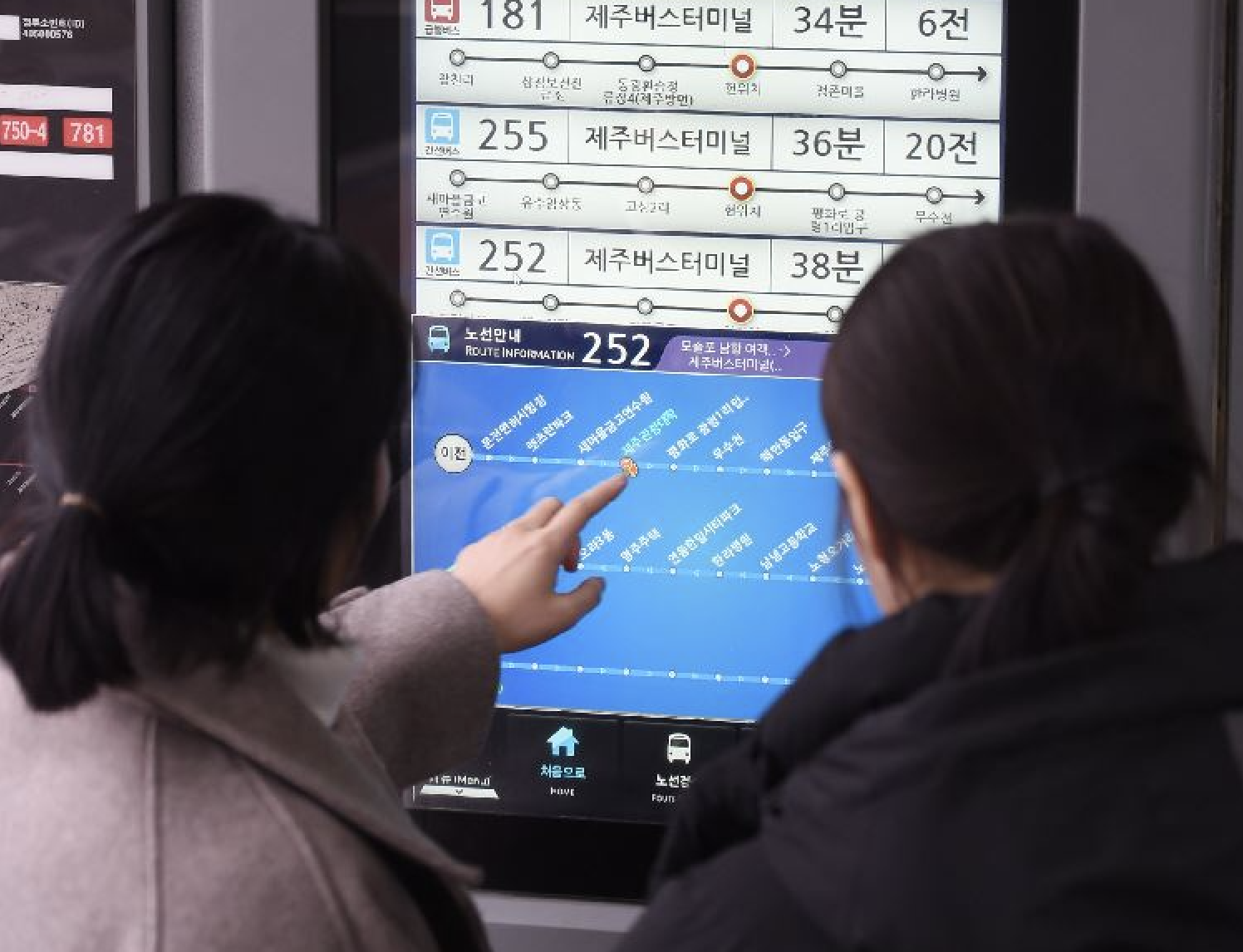
The Jeju Bus Information System (BIS) is one of the flagship projects of Sum Engineering, a company that has been exclusively collaborating on key initiatives for Jeju Special Self-Governing Province, including the Disaster Alert System and Jeju Aquarium.
As part of the BIS revamp project, I had the opportunity to contribute as a UX/UI Designer, making this my first professional UX/UI project. This experience was especially meaningful, as it marked the beginning of my journey in creating user-centered digital solutions.
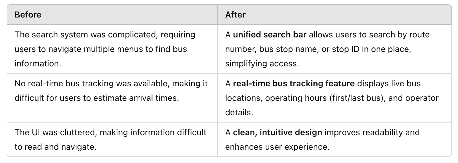
The redesigned BIS website aimed to make bus information more accessible, enhance usability, and establish a modern, user-friendly interface that better serves commuters and visitors navigating Jeju’s public transportation system.
The key objectives of this revamp were:
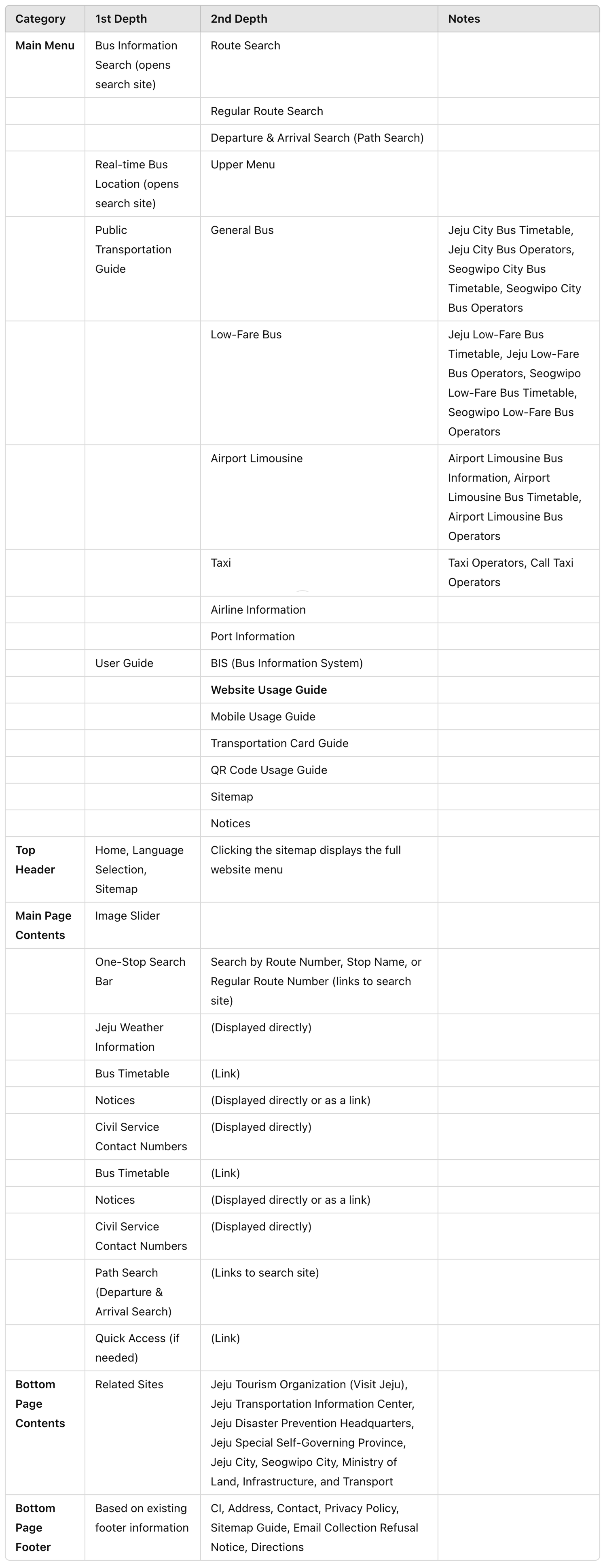
During the website redesign, three different menu structures were proposed. After evaluating accessibility and usability, we decided on the third option as it provides better information accessibility.
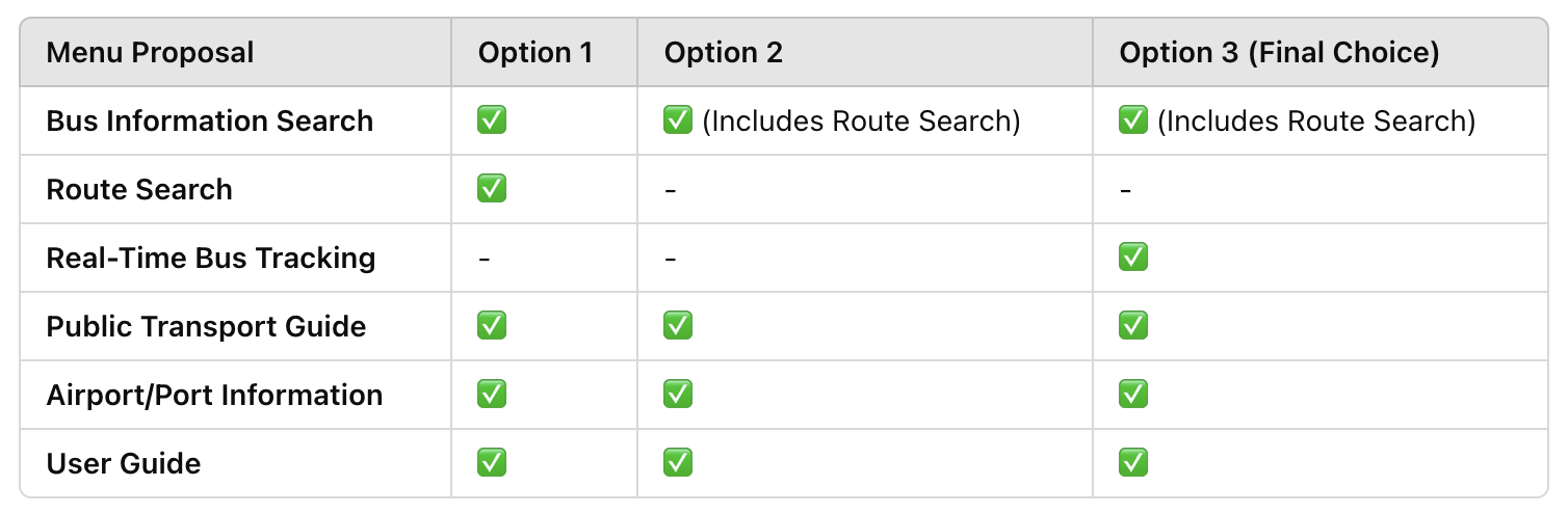
✔ Option 3 was chosen for better accessibility and a more streamlined user experience.
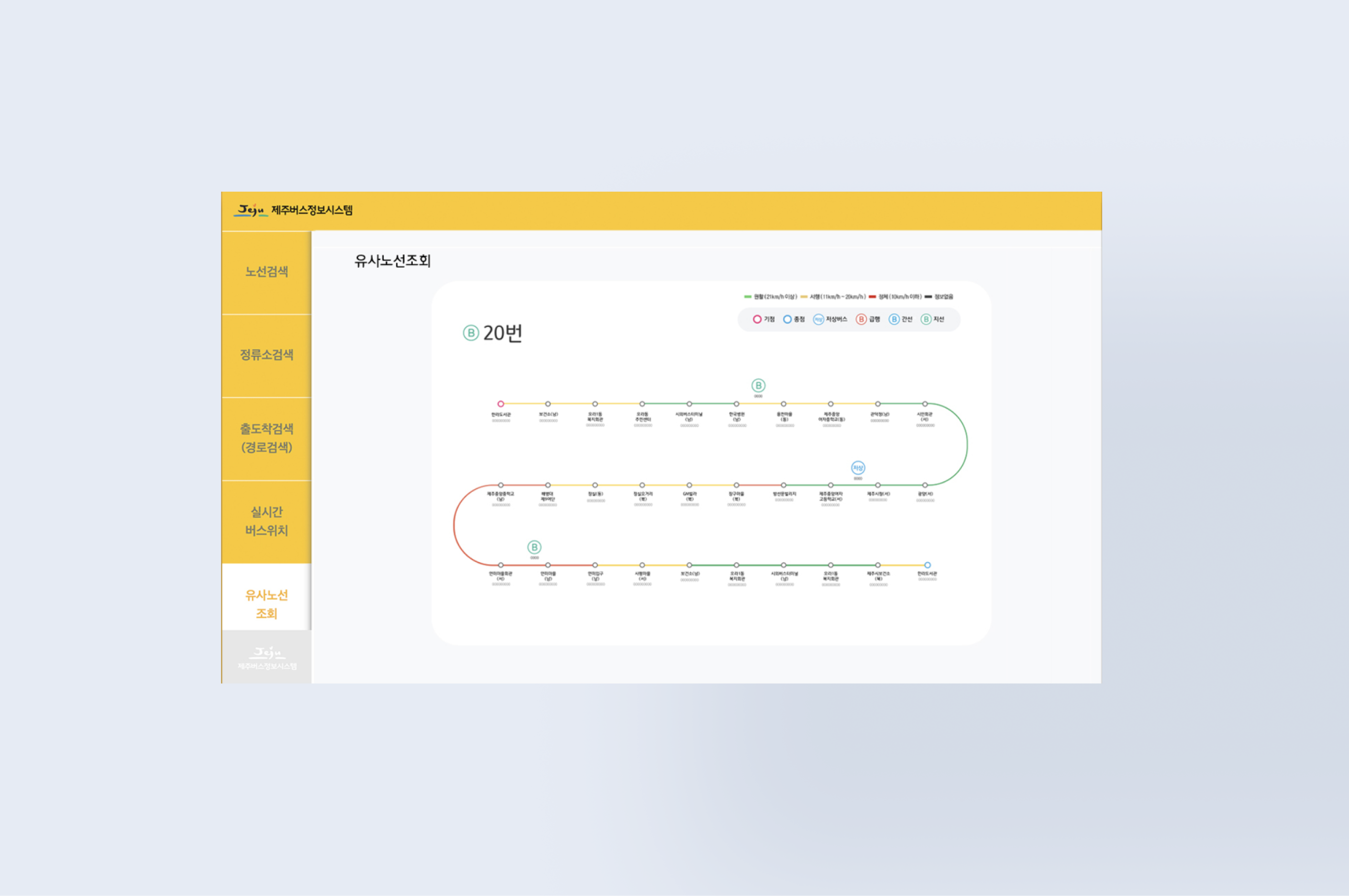
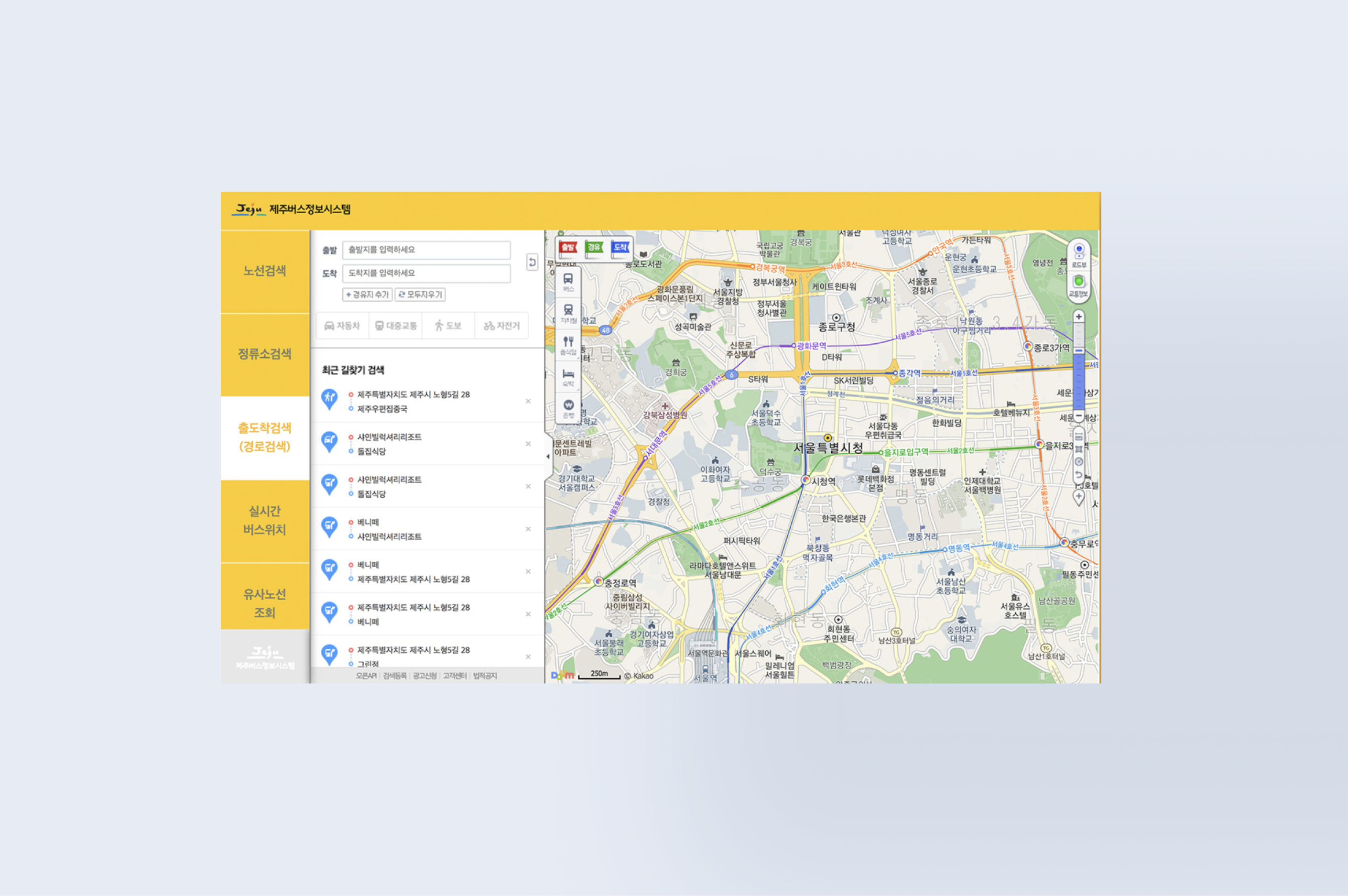
✔ Instead of separate menu categories like Route Information, Real-Time Operation Info, Transfer Info, and Tourist Info, we structured the menu into five clear categories for easier navigation.
✔ UI Draft review and feedback will be conducted before finalizing the menu order.
To enhance accessibility and usability, we explored three UI draft options for the Bus Information System (BIS) website. Each draft presents a different approach to layout, information structure, and visual hierarchy.
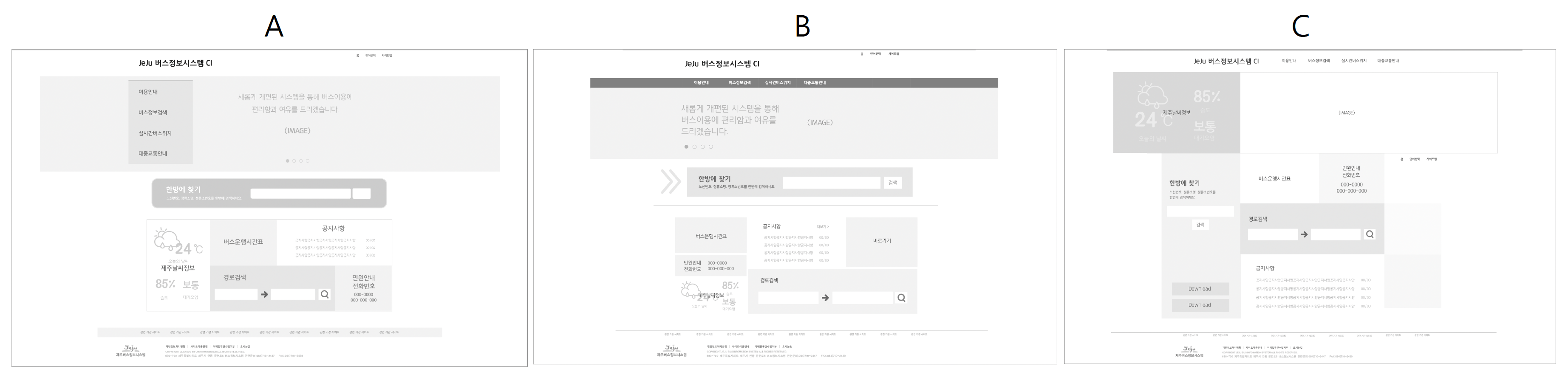
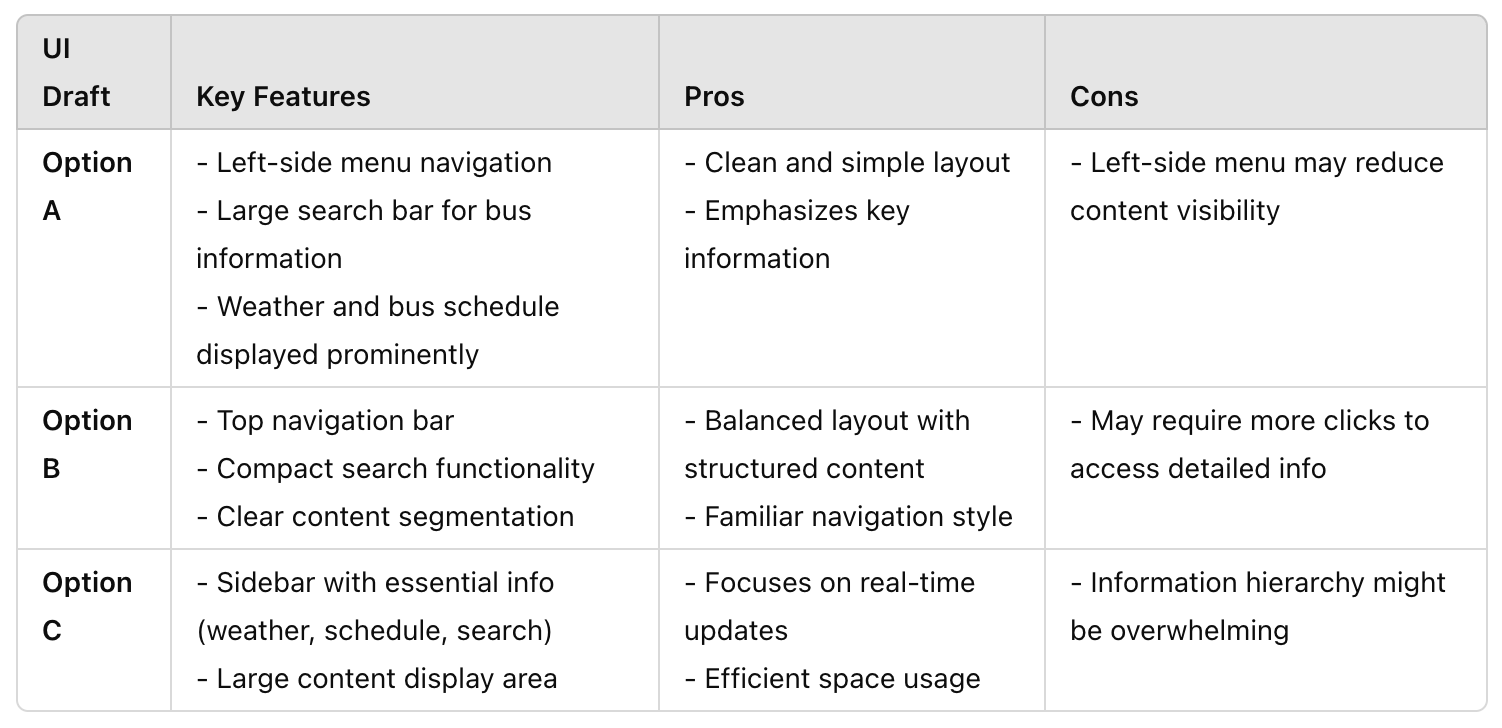
After reviewing all options and gathering feedback, we determined that Option A offers the best balance of accessibility, usability, and information clarity.
Why Option A?
✅ Clean and simple layout – The design minimizes unnecessary elements and highlights essential information, making it intuitive for users.
✅ Emphasis on key information – Important details like weather and bus schedules are prominently displayed, allowing users to access critical data quickly.
✅ Large search bar – The prominent search functionality makes it easy for users to find the information they need efficiently.
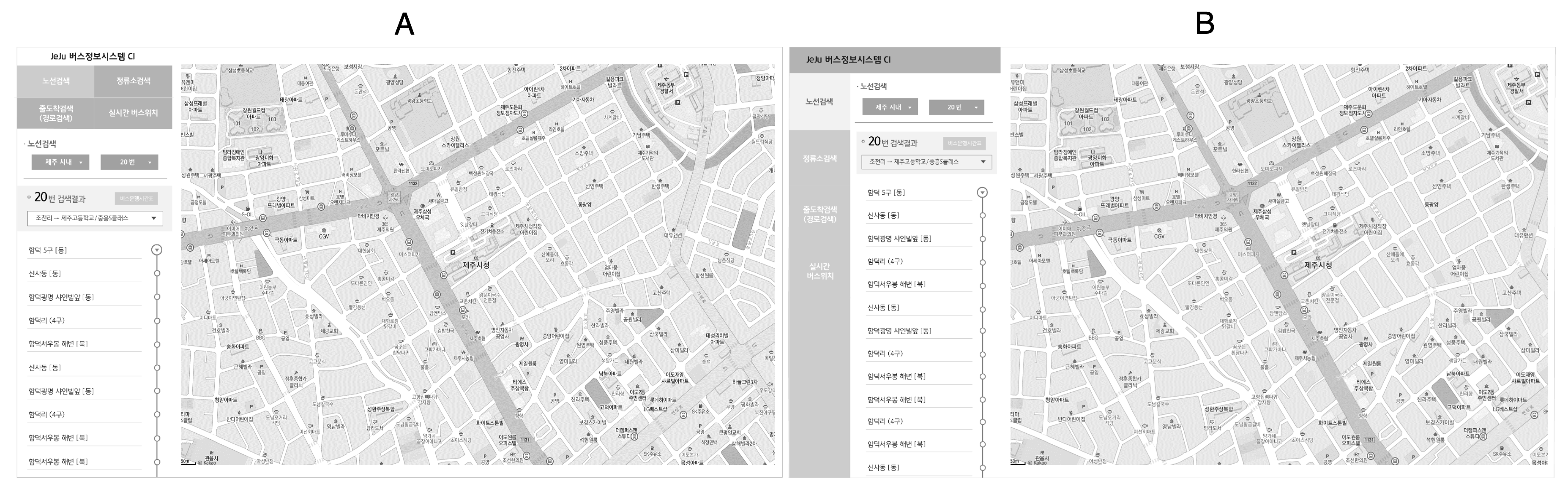
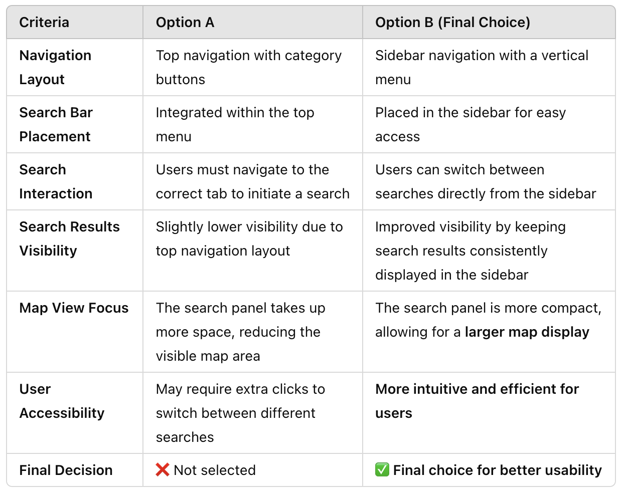
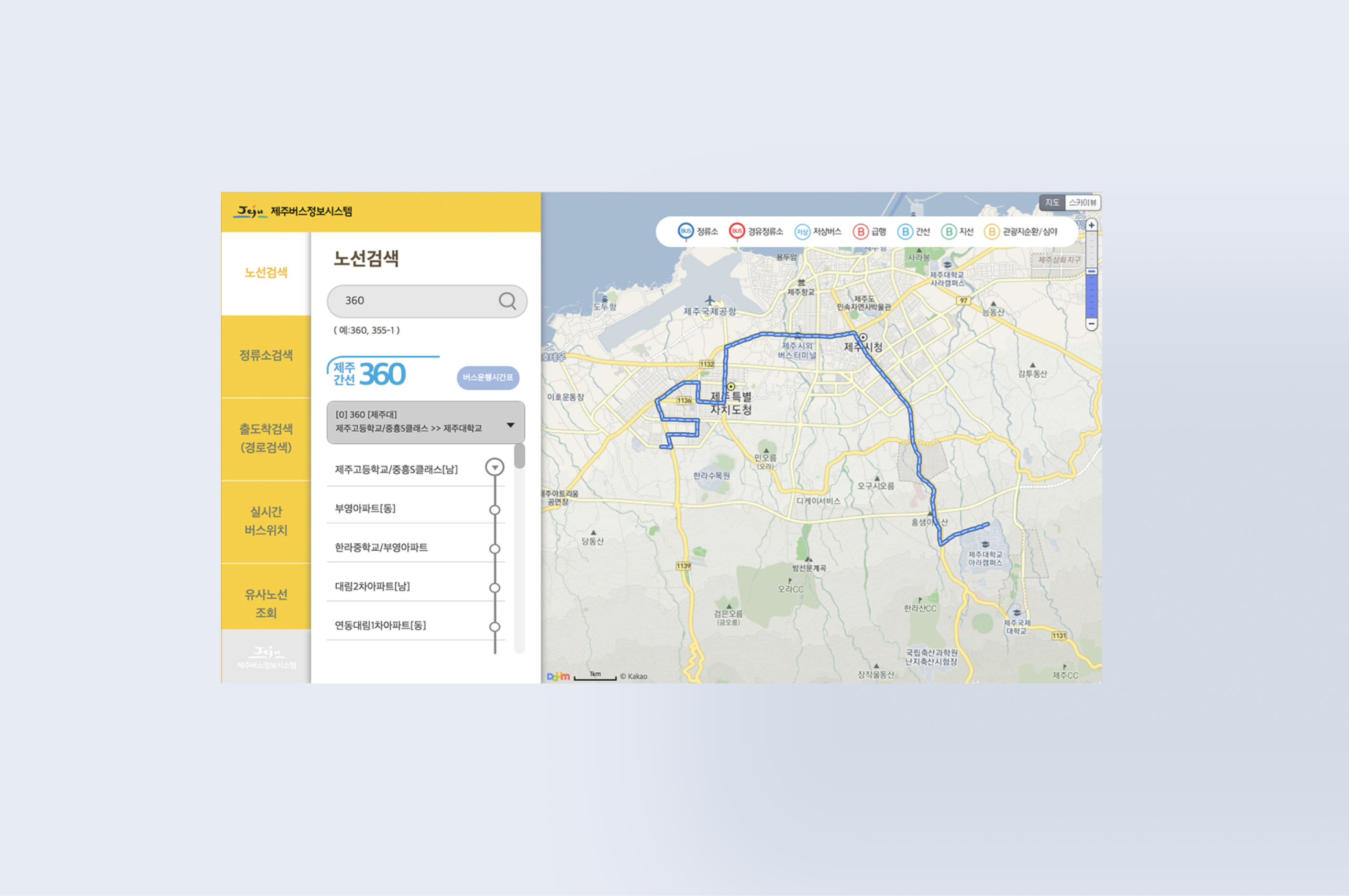
✅ Better Information Visibility → The sidebar navigation ensures search results are always visible.
✅ Larger Map Display → The UI allows more screen space for the map, improving user experience.
✅ More Intuitive Navigation → Users can quickly switch between search types without extra clicks.
✅ Improved User Efficiency → Reduces steps required to access search results, enhancing usability.
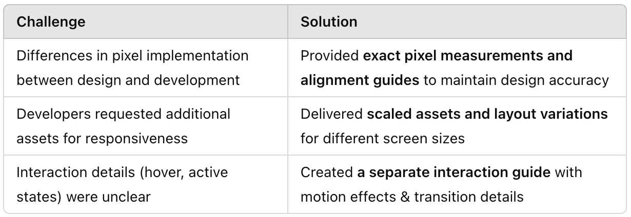
I ensured a seamless handoff from design to development by creating pixel-perfect documentation and maintaining close communication with the development team. This involved delivering precise UI specifications, exporting optimized assets, and clarifying design decisions through structured documentation and regular discussions.
Tools Used: Adobe Illustrator, Photoshop
Deliverables for Development:
✔ Pixel-perfect UI design specs (dimensions, margins, paddings, colors)
✔ Assets export (SVGs, PNGs, icons, and UI components)
✔ Typography & spacing guidelines
✔ Interaction & hover state documentation
• Created a structured design document with pixel-precise UI details.
• Regular syncs with developers to clarify design decisions and resolve UI inconsistencies.
• Used Slack & shared annotated design files to ensure alignment between design and development.
• Provided feedback during development to ensure UI fidelity with the original design
✅ A well-documented, pixel-accurate UI successfully implemented by the development team.
✅ Smooth collaboration between design & development, reducing iteration cycles.
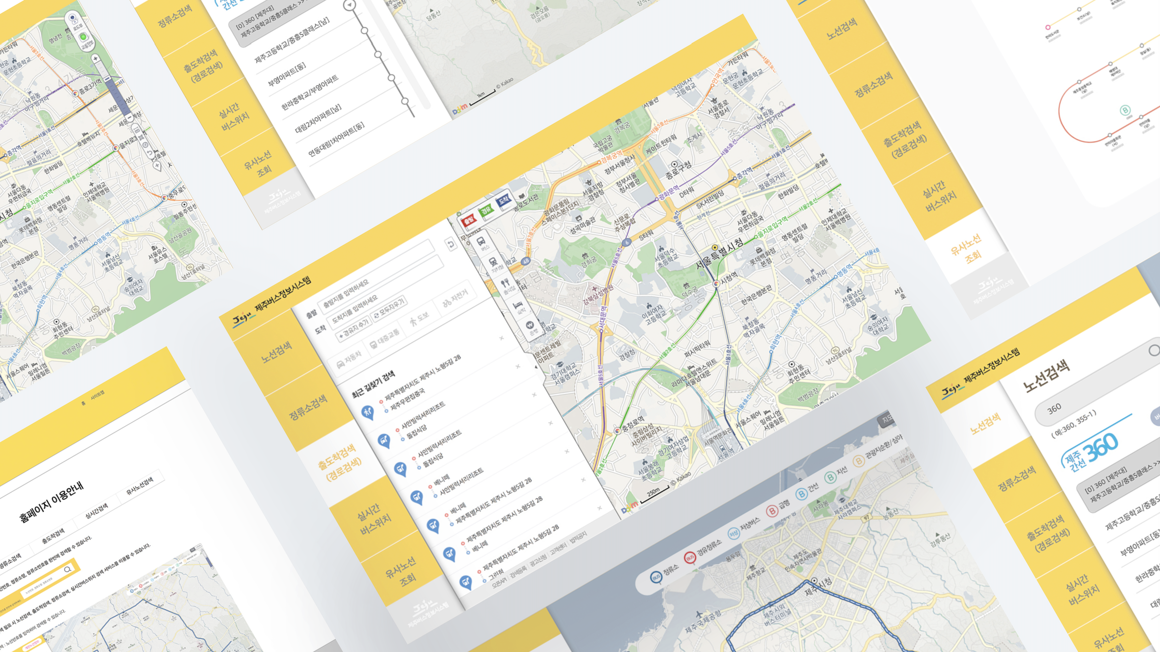
This large-scale transportation upgrade set the foundation for a more efficient and inclusive bus network in Jeju.
1. Bridging the Gap Between Design & Development
2. Balancing Simplicity & Information Density
3. User-Centered Decision Making
1. Design Handoff Process
2. Scalability & Future Adaptability
3. Mobile-First Optimization

I am currently available for new projects and collaborations, bringing a wealth of experience in crafting innovative, user-centered designs


.jpg)